2Fm - Belong To
I had the privilege of collaborating with The Reelists on a deeply meaningful campaign for Belong To, Ireland’s national LGBTQ+ youth organization.
The project involved animating the real, unscripted coming-out experiences of LGBTQ+ youth and their parents. Dealing with sensitive topics like gender identity, the fear of rejection, and the journey toward acceptance, our goal was to craft a visual language that felt authentic and emotionally resonant.
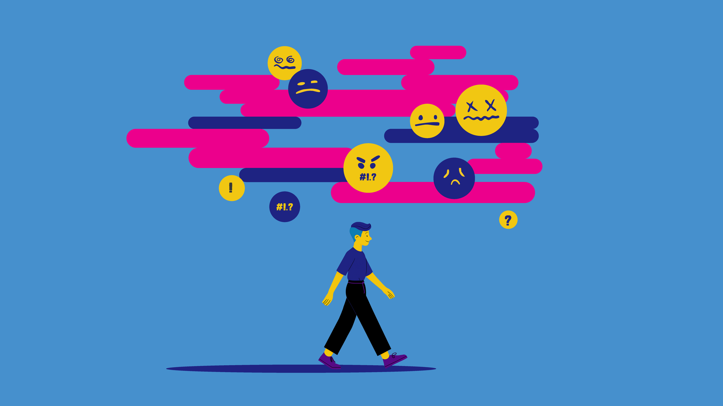
Because these were real audio interviews, we needed an art direction that protected the speakers' identities without losing the human connection. We utilized fluid 2D silhouettes navigating metaphorical landscapes such as timelines, bridges, and cracking "shields" that represented the impact of negative words. By contrasting muted, grey tones during moments of anxiety with vibrant, glowing colors during moments of community and acceptance, the animation visually mirrored the emotional highs and lows of each personal journey.
The Parents' Perspectives
The Youth's Stories
ASK
The Reelists brought me on to help bring to life a deeply personal campaign for BelongTo, Ireland's national LGBTQ+ youth organization. The goal was to animate the real, unscripted coming-out stories of LGBTQ+ youth (like James, Liana, and Richard) and parents navigating their children's journeys (like Aimee and Krista). We needed to create a visual language that felt authentic, emotionally resonant, and safe for the subjects sharing their vulnerable experiences.
Approach
Because these were real audio interviews dealing with sensitive topics like gender identity, sexuality, and the fear of rejection, we needed an art direction that protected the speakers' identities without losing the human connection.
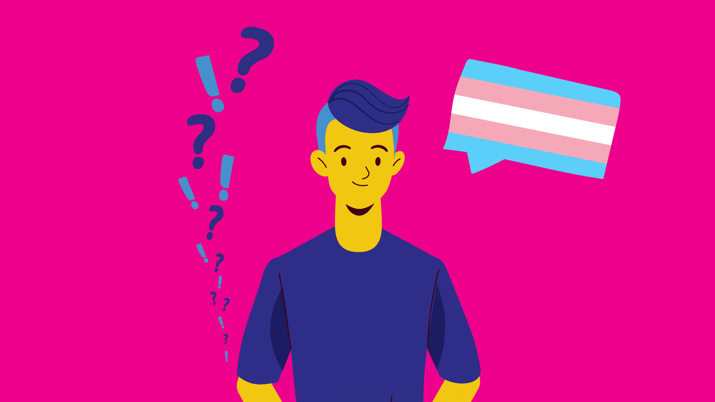
The visual strategy relied on fluid 2D silhouettes navigating metaphorical landscapes such as timelines, building bridges across gaps, and cracking "shields" representing the impact of negative words. We utilized dynamic UI elements like floating emojis and thought bubbles to represent societal pressures and support systems. By contrasting muted, grey tones during moments of anxiety with vibrant, glowing colors during moments of acceptance and community, the animation visually mirrored the emotional highs and lows of each personal journey.
SYSTEMS & SCALABILITY
Due to the sensitive nature of the topic and the tight budget constraints of a nonprofit campaign, it was essential that the production pipeline was built for maximum flexibility and reuse. Across five distinct coming-out stories spanning perspectives from both youth and parents we needed to establish a unified visual language that was scalable.
To achieve this, I developed a modular asset library of 2D silhouettes, dynamic UI elements (like floating emojis, thought bubbles, and text), and metaphorical environments. This system allowed us to:
Adapt Characters: A single base rig could be quickly modified to represent different subjects from an androgynous teen to a supportive mother without needing to animate every frame from scratch.
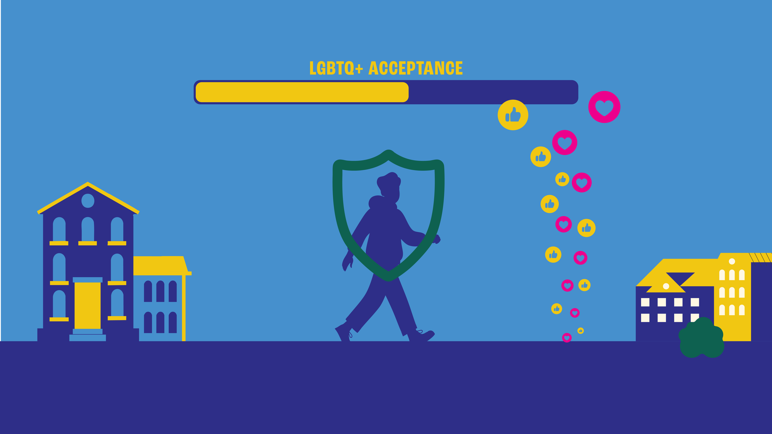
Reuse Metaphors: Visual devices like the cracking "shields" of negative words and the fluctuating "LGBTQ+ Acceptance" progress bars were built as reusable components that could be easily dropped into different scenes to maintain narrative consistency.
Streamline Environments: By leaning heavily on color psychology shifting from oppressive grey tones to vibrant, glowing colors we could dramatically alter the emotional weight of a scene without requiring complex, time-consuming background art.
This approach ensured that the storytelling remained focused and deeply empathetic, while allowing the project to stay within budget and on schedule.
DESIGN
To honor the vulnerability of the audio interviews, the design language needed to strike a delicate balance between anonymity and profound empathy. We anchored the character design in faceless, fluid silhouettes. This deliberate choice not only protected the real identities of the youths and parents but also transformed them into universal figures, allowing anyone watching to see themselves or their own children in the narrative.
Rather than relying strictly on literal locations, the environments functioned as psychological landscapes. We visualized internal struggles and societal pressures through bold, relatable metaphors: personal timelines styled as endless streets, physical "shields" shattering under the weight of censored slurs, and literal bridges being built across generational gaps. Modern communication was woven directly into the world-building, utilizing dynamic UI elements like floating emojis, thought bubbles, and text to externalize the subjects' inner thoughts and the reactions of those around them.
Color served as our primary storytelling tool for mapping emotional arcs. Scenes dealing with isolation, fear of rejection, and anxiety were deliberately stripped back to oppressive greys and muted tones. As each story progressed toward acceptance, understanding, and community, the palette dramatically shifted—flooding the screen with vibrant, glowing hues, specific Pride flags (such as Trans, Pansexual, and Non-binary), and the signature "Belong To Pink" to visually signify hope and resolution.